MindAlert
An iOS app focus on helping people in suicidal crisis to create and active their Safety Plan.


A Quick Overview
Our Challenge
The challenge was to build a project based on the topic of HackDavis 2022, Code for Social Good, within a 24-hour constraint.
The Plan
We plan to design an app that shrinks these barriers and allows easy access to medical resources for people during a suicidal crisis.
Understand the users’ needs during a suicidal crisis
Learn how the user interacts with
our design
The Problem
We found out during a suicidal crisis, sufferers are easily deterred by perceived and real barriers, and ultimately do not receive the critical help they need.
Our Team
In our team, I am responsible for UX design and programming, and Johanna Kuschnereit for UX research.
Both of us were involved in the prototyping and testing process.
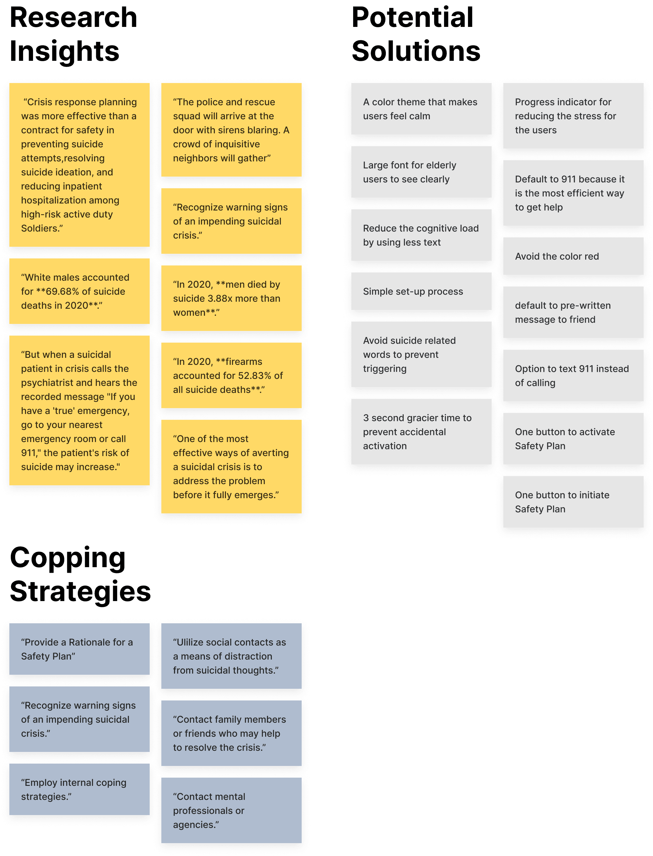
Understand Our Users
Our Goal
We wanted to understand the barriers and pain points people in a suicidal crisis face.
Identify research-backed methods of preventing harm or death during a suicidal crisis to use as a base for the app.
Define Our Target Users
We decided to focus on men and women of all races who are 40+ years old. Based on the statistics, this group has the highest rate of suicidal intention.
Methodology and Procdure
Johanna conducted a literature review to learn about research-backed methods and strategies to help cope with suicidal urges.
Additionally, She browsed online resources to understand the real-life experience of the sufferer when in a crisis.
The Findings
Johanna learned that
Stanley-Brown Safety Planning is an intervention that helps people at risk for suicide to be prepared
for a crisis and keep themselves safe.
The feeling of burdening others.
In a suicidal crisis, the individual often does not feel worthy of the help of others.
Concerns about Privacy.
Individuals do not want blaring sirens or other attention at their residences.
Discomfort.
When suicidal, individuals don’t have the emotional energy to have uncomfortable conversations.
These findings guided our ideation process and provided a base structure for the app.
Check out Johanna’s Portfolio to learn more research detail.

So where was I?
Simotiniously, I dove into the Apple Developer website, learning swiftUI.
Gather Insights,
and Move Forward
HMW Statement
How might we make it simple for people in suicidal crisis to quickly take action before their doubts grow and
seek help from others?
Solution
We decided to focus on the onboarding process and simplify it to ensure that users complete the entire process and have their safety plan ready for the next emergency.
Inspired by medical-alert buttons, the idea of a panic button came to life.
Affinity Mapping
We gathered all findings and ideas we ideated as an affinity map. With all that, we generated our solution.
Creating
the Experience
Challenge
Our challenge was to come up with an inclusive onboarding experience with minimal user dropoff, at the same time, easy for users to interact. And, of course, time was flying.
Solution Highlights
Large text + SF symbols
This combination increases legibility and avoids visual destruction.
Consistant components
This helps users navigate different pages easily and benefits users with difficulty reading.
Conversational tone
We address users by their names to personalize the user experience.
Inclusive color scheme
Peach stands for pleasant and friendly. Green stands for balance, nature, and calm.
Timeline
12:30
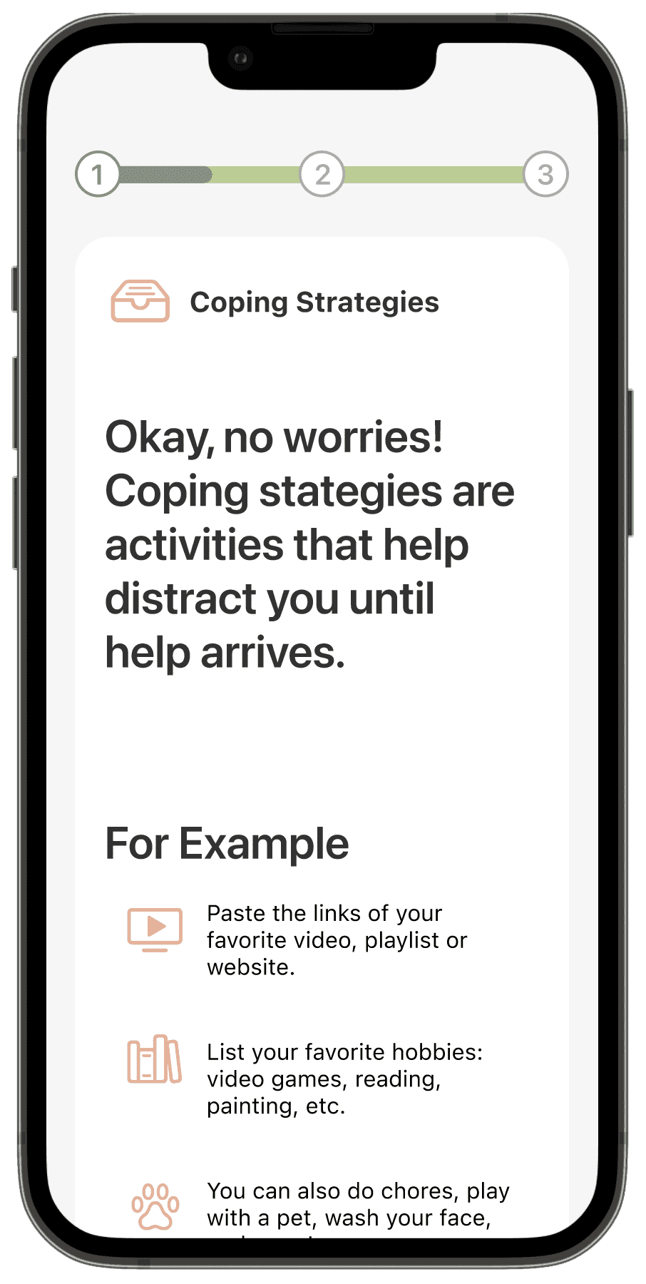
Johanna built wireframes based on the Safety Plan we dicovered during the research phase.
13:30
Johanna established wireframes and information architecture. We discuss the detail of each page and how to activate the Safety Plan.
14:00
Before kicking off the visual design,
we decided on the color scheme for MindAlert.
14:30
00:30
I built the low- and later high-fidelity prototype based on our research, wireframe, color scheme, and information architecture.

Wondering where is Johanna?
Johanna prepared the presentation slides and recruited subjects for the usability test while I was building the prototypes.

Wireframe

Mid-Fidelity Prototype

High-Fidelity Prototype
Test It Out
with Real Users
Our Goal
To identify any issues with the flow of using the app and onboarding process.*
Analyzing whether the interface is accessible and practical to various age groups and genders.
* this information was critical because an easy onboarding process and minimal user dropoff was essential for MindAlert fulfill its purpose.
The Challenge
Time. By this point, it was 1am, and we had less than half the time to complete the project. We knew we had to start developing the app as soon as possible.
A complete and representative usability study is a luxury for us, but we decided that limited feedback is significantly more useful than none.
Test Group
3 participants
Variety in age and gender
30 minute sessions
Moderated usability study on zoom
The Findings
Despite the small number of participants, we gained critically important information, which we turned into actionable insights.
Unclear language
All users were confused about the “crisis” the app was addressing. Some were confused about the disclaimer page and its meaning.
Significance of the Emegrency Button
Some users did not immediately understand what would happen if the emergency button was pressed.
The Good.
All users, unaffected by age or gender, expressed feeling comfortable and welcomed thanks to UI elements!
The Challenge
We discussed the findings and identified ways to change the wording. and interface to clear up the confusion voiced by users.
After the hackathon, we recruited two more participants and created a usability report. We improved MindAlert with more detailed craft based on the report.
Before
After

With the fixed navigation stick to the bottom, users always know what's the next action to take.
Before

After

The button-like Strategy Label confused users, so I replaced it with a card layout with appropriate affordance.
Before

After

Moving panic button description to the finishing page reduce the information user need to memorize.
Before

After

Adding descriptive text below the botton to increase the clearification and avoid confusion during the crisis.
Built it
on SwiftUI
The challenge
Features were halted due to the privacy terms of iOS: sending messages and starting a call without users’ confirmation is not allowed.

Our solution
We decided to use CallKit and Instant Messaging to deliver the message through the app. However, due to time constraints, we decided to implement them after the hackathon.
Final Design
As time was running out, we were able to finalize the design, iOS app, and final presentation and submitted the project with around 30 minutes to go.
I highly recommend you try the interactive mockup for the best experience.
Try the prototype
The step-by-step onboarding with an encouraging conversational tone establishes an inclusive experience
for our users.


The home screen focuses on the most essential feature with no extra distractions, ensuring our users get the help they need whenever needed.
Final
Thoughts
What I learned
Under extreme time pressure, it is essential to simplify the design process.
Collaboration is vital when working with a team under intense time pressure.
To build a better product, constantly communicating with developers during the design process is crucial.
User input is essential even with limited feedback.
Storytelling is important when communicating with users and stakeholders.
The Impact
The judges noted that they appreciated our intense focus on the user, which was reflected in the design.
MindAlert was awarded the Best Design of HackDavis 2022.
We were thrilled to hear that we had successfully portrayed this in our design, as focus on user needs was our
primary goal.
What’s Next?
We are currently running another round of usability test with a more diverse and representative group of users.
We plan to collaborate with mental health professionals and developers to publish MindAlert on the App Store.